布局实战
2020/10/20...大约 9 分钟
本章包括了一些经典的布局实战案例。
Flex 布局实战
下面我们将通过骰子,来很好的在实战中展示 Flex 布局的功能与美丽。
骰子的一面,最多可以放置 9 个点。
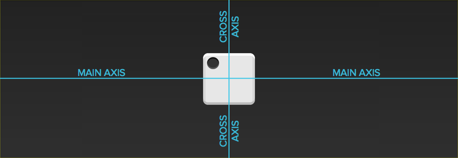
下面,就来看看 Flex 如何实现,从 1 个点到 9 个点的布局。div 元素 (代表骰子的一个面) 是 Flex 容器,span 元素 (代表一个点) 是 Flex 项目。如果有多个项目,就要添加多个 span 元素,以此类推。
单项目
首先,只有左上角 1 个点的情况。Flex 布局默认就是首行左对齐,所以一行代码就够了。
点位 1
<div class="dice-container">
  <div class="box">
    <span class="item" />
  </div>
</div>
.box {
display: flex;
}
/* Common styles */
.dice-container {
display: flex;
justify-content: center;
align-items: center;
height: 150px;
background-color: #000;
}
.dice-container .box {
width: 90px;
height: 90px;
padding: 8px;
border-radius: 8px;
background-color: #f8f8f8;
}
.dice-container .item {
width: 24px;
height: 24px;
margin: 3px;
border-radius: 50%;
background-color: #000;
}设置项目的对齐方式,就能实现居中对齐和右对齐。
点位 2
<div class="dice-container">
  <div class="box">
    <span class="item" />
  </div>
</div>
.box {
display: flex;
justify-content: center;
}
/* Common styles */
.dice-container {
display: flex;
justify-content: center;
align-items: center;
height: 150px;
background-color: #000;
}
.dice-container .box {
width: 90px;
height: 90px;
padding: 8px;
border-radius: 8px;
background-color: #f8f8f8;
}
.dice-container .item {
width: 24px;
height: 24px;
margin: 3px;
border-radius: 50%;
background-color: #000;
}点位 3
<div class="dice-container">
  <div class="box">
    <span class="item" />
  </div>
</div>
.box {
display: flex;
justify-content: flex-end;
}
/* Common styles */
.dice-container {
display: flex;
justify-content: center;
align-items: center;
height: 150px;
background-color: #000;
}
.dice-container .box {
width: 90px;
height: 90px;
padding: 8px;
border-radius: 8px;
background-color: #f8f8f8;
}
.dice-container .item {
width: 24px;
height: 24px;
margin: 3px;
border-radius: 50%;
background-color: #000;
}设置交叉轴对齐方式,可以垂直移动主轴。
点位 4
<div class="dice-container">
  <div class="box">
    <span class="item" />
  </div>
</div>
.box {
display: flex;
align-items: center;
}
/* Common styles */
.dice-container {
display: flex;
justify-content: center;
align-items: center;
height: 150px;
background-color: #000;
}
.dice-container .box {
width: 90px;
height: 90px;
padding: 8px;
border-radius: 8px;
background-color: #f8f8f8;
}
.dice-container .item {
width: 24px;
height: 24px;
margin: 3px;
border-radius: 50%;
background-color: #000;
}点位 5
<div class="dice-container">
  <div class="box">
    <span class="item" />
  </div>
</div>
.box {
display: flex;
justify-content: center;
align-items: center;
}
/* Common styles */
.dice-container {
display: flex;
justify-content: center;
align-items: center;
height: 150px;
background-color: #000;
}
.dice-container .box {
width: 90px;
height: 90px;
padding: 8px;
border-radius: 8px;
background-color: #f8f8f8;
}
.dice-container .item {
width: 24px;
height: 24px;
margin: 3px;
border-radius: 50%;
background-color: #000;
}点位 8
<div class="dice-container">
  <div class="box">
    <span class="item" />
  </div>
</div>
.box {
display: flex;
justify-content: center;
align-items: flex-end;
}
/* Common styles */
.dice-container {
display: flex;
justify-content: center;
align-items: center;
height: 150px;
background-color: #000;
}
.dice-container .box {
width: 90px;
height: 90px;
padding: 8px;
border-radius: 8px;
background-color: #f8f8f8;
}
.dice-container .item {
width: 24px;
height: 24px;
margin: 3px;
border-radius: 50%;
background-color: #000;
}点位 9
<div class="dice-container">
  <div class="box">
    <span class="item" />
  </div>
</div>
.box {
display: flex;
justify-content: flex-end;
align-items: flex-end;
}
/* Common styles */
.dice-container {
display: flex;
justify-content: center;
align-items: center;
height: 150px;
background-color: #000;
}
.dice-container .box {
width: 90px;
height: 90px;
padding: 8px;
border-radius: 8px;
background-color: #f8f8f8;
}
.dice-container .item {
width: 24px;
height: 24px;
margin: 3px;
border-radius: 50%;
background-color: #000;
}双项目
双点位 13
<div class="dice-container">
  <div class="box">
    <span class="item" />
    <span class="item" />
  </div>
</div>
.box {
display: flex;
justify-content: space-between;
}
/* Common styles */
.dice-container {
display: flex;
justify-content: center;
align-items: center;
height: 150px;
background-color: #000;
}
.dice-container .box {
width: 90px;
height: 90px;
padding: 8px;
border-radius: 8px;
background-color: #f8f8f8;
}
.dice-container .item {
width: 24px;
height: 24px;
margin: 3px;
border-radius: 50%;
background-color: #000;
}双点位 17
<div class="dice-container">
  <div class="box">
    <span class="item" />
    <span class="item" />
  </div>
</div>
.box {
display: flex;
flex-direction: column;
justify-content: space-between;
}
/* Common styles */
.dice-container {
display: flex;
justify-content: center;
align-items: center;
height: 150px;
background-color: #000;
}
.dice-container .box {
width: 90px;
height: 90px;
padding: 8px;
border-radius: 8px;
background-color: #f8f8f8;
}
.dice-container .item {
width: 24px;
height: 24px;
margin: 3px;
border-radius: 50%;
background-color: #000;
}双点位 28
<div class="dice-container">
  <div class="box">
    <span class="item" />
    <span class="item" />
  </div>
</div>
.box {
display: flex;
flex-direction: column;
justify-content: space-between;
align-items: center;
}
/* Common styles */
.dice-container {
display: flex;
justify-content: center;
align-items: center;
height: 150px;
background-color: #000;
}
.dice-container .box {
width: 90px;
height: 90px;
padding: 8px;
border-radius: 8px;
background-color: #f8f8f8;
}
.dice-container .item {
width: 24px;
height: 24px;
margin: 3px;
border-radius: 50%;
background-color: #000;
}双点位 39
<div class="dice-container">
  <div class="box">
    <span class="item" />
    <span class="item" />
  </div>
</div>
.box {
display: flex;
flex-direction: column;
justify-content: space-between;
align-items: flex-end;
}
/* Common styles */
.dice-container {
display: flex;
justify-content: center;
align-items: center;
height: 150px;
background-color: #000;
}
.dice-container .box {
width: 90px;
height: 90px;
padding: 8px;
border-radius: 8px;
background-color: #f8f8f8;
}
.dice-container .item {
width: 24px;
height: 24px;
margin: 3px;
border-radius: 50%;
background-color: #000;
}双点位 15
<div class="dice-container">
  <div class="box">
    <span class="item" />
    <span class="item" />
  </div>
</div>
.box {
display: flex;
}
.item:nth-child(2) {
align-self: center;
}
/* Common styles */
.dice-container {
display: flex;
justify-content: center;
align-items: center;
height: 150px;
background-color: #000;
}
.dice-container .box {
width: 90px;
height: 90px;
padding: 8px;
border-radius: 8px;
background-color: #f8f8f8;
}
.dice-container .item {
width: 24px;
height: 24px;
margin: 3px;
border-radius: 50%;
background-color: #000;
}双点位 19
<div class="dice-container">
  <div class="box">
    <span class="item" />
    <span class="item" />
  </div>
</div>
.box {
display: flex;
justify-content: space-between;
}
.item:nth-child(2) {
align-self: flex-end;
}
/* Common styles */
.dice-container {
display: flex;
justify-content: center;
align-items: center;
height: 150px;
background-color: #000;
}
.dice-container .box {
width: 90px;
height: 90px;
padding: 8px;
border-radius: 8px;
background-color: #f8f8f8;
}
.dice-container .item {
width: 24px;
height: 24px;
margin: 3px;
border-radius: 50%;
background-color: #000;
}三项目
三点
<div class="dice-container">
  <div class="box">
    <span class="item" />
    <span class="item" />
    <span class="item" />
  </div>
</div>
.box {
display: flex;
}
.item:nth-child(2) {
align-self: center;
}
.item:nth-child(3) {
align-self: flex-end;
}
/* Common styles */
.dice-container {
display: flex;
justify-content: center;
align-items: center;
height: 150px;
background-color: #000;
}
.dice-container .box {
width: 90px;
height: 90px;
padding: 8px;
border-radius: 8px;
background-color: #f8f8f8;
}
.dice-container .item {
width: 24px;
height: 24px;
margin: 3px;
border-radius: 50%;
background-color: #000;
}四项目
四点
<div class="dice-container">
  <div class="box">
    <div class="column">
      <span class="item" />
      <span class="item" />
    </div>
    <div class="column">
      <span class="item" />
      <span class="item" />
    </div>
  </div>
</div>
.box {
display: flex;
flex-wrap: wrap;
align-content: space-between;
}
.column {
flex-basis: 100%;
display: flex;
justify-content: space-between;
}
/* Common styles */
.dice-container {
display: flex;
justify-content: center;
align-items: center;
height: 150px;
background-color: #000;
}
.dice-container .box {
width: 90px;
height: 90px;
padding: 8px;
border-radius: 8px;
background-color: #f8f8f8;
}
.dice-container .item {
width: 24px;
height: 24px;
margin: 3px;
border-radius: 50%;
background-color: #000;
}六项目
六点
<div class="dice-container">
  <div class="box">
    <span class="item" />
    <span class="item" />
    <span class="item" />
    <span class="item" />
    <span class="item" />
    <span class="item" />
  </div>
</div>
.box {
display: flex;
flex-wrap: wrap;
justify-content: space-between;
align-content: space-between;
}
/* Common styles */
.dice-container {
display: flex;
justify-content: center;
align-items: center;
height: 150px;
background-color: #000;
}
.dice-container .box {
width: 90px;
height: 90px;
padding: 8px;
border-radius: 8px;
background-color: #f8f8f8;
}
.dice-container .item {
width: 24px;
height: 24px;
margin: 3px;
border-radius: 50%;
background-color: #000;
}六点 2
<div class="dice-container">
  <div class="box">
    <span class="item" />
    <span class="item" />
    <span class="item" />
    <span class="item" />
    <span class="item" />
    <span class="item" />
  </div>
</div>
.box {
display: flex;
flex-direction: column;
flex-wrap: wrap;
justify-content: space-between;
align-content: space-between;
}
/* Common styles */
.dice-container {
display: flex;
justify-content: center;
align-items: center;
height: 150px;
background-color: #000;
}
.dice-container .box {
width: 90px;
height: 90px;
padding: 8px;
border-radius: 8px;
background-color: #f8f8f8;
}
.dice-container .item {
width: 24px;
height: 24px;
margin: 3px;
border-radius: 50%;
background-color: #000;
}您还可以使用高级选择器:
一个图案
<div class="dice-container">
  <div class="box">
    <div class="row">
      <span class="item" />
      <span class="item" />
      <span class="item" />
    </div>
    <div class="row">
      <span class="item" />
    </div>
    <div class="row">
      <span class="item" />
      <span class="item" />
    </div>
  </div>
</div>
.box {
display: flex;
flex-wrap: wrap;
}
.row {
flex-basis: 100%;
display: flex;
}
.row:nth-child(2) {
justify-content: center;
}
.row:nth-child(3) {
justify-content: space-between;
}
/* Common styles */
.dice-container {
display: flex;
justify-content: center;
align-items: center;
height: 150px;
background-color: #000;
}
.dice-container .box {
width: 90px;
height: 90px;
padding: 8px;
border-radius: 8px;
background-color: #f8f8f8;
}
.dice-container .item {
width: 24px;
height: 24px;
margin: 3px;
border-radius: 50%;
background-color: #000;
}网格布局
基本网格布局
最简单的网格布局,就是平均分布。在容器里面平均分配空间,跟上面的骰子布局很像,但是需要设置项目的自动缩放。
网格布局
<div class="grid-wrapper">
  <div class="grid-cell">1</div>
</div>
<div class="grid-wrapper">
  <div class="grid-cell">1/2</div>
  <div class="grid-cell">1/2</div>
</div>
<div class="grid-wrapper">
  <div class="grid-cell">1/3</div>
  <div class="grid-cell">1/3</div>
  <div class="grid-cell">1/3</div>
</div>
<div class="grid-wrapper">
  <div class="grid-cell">Mr.Hope 很帅!</div>
  <div class="grid-cell">
    Mr.Hope 很帅! Mr.Hope 很帅! Mr.Hope 很帅! Mr.Hope 很帅! Mr.Hope 很帅! Mr.Hope 很帅! Mr.Hope
    很帅! Mr.Hope 很帅! Mr.Hope 很帅! Mr.Hope 很帅! Mr.Hope 很帅! Mr.Hope 很帅! Mr.Hope 很帅!
    Mr.Hope 很帅! Mr.Hope 很帅!
  </div>
</div>
CSS 代码如下。
.grid-wrapper {
  display: flex;
}

.grid-cell {
  flex: 1;
}

/* Common styles */
.grid-cell {
  margin: 4px;
  padding: 12px;
  border-radius: 4px;
  background-color: rgb(207, 232, 220);
  color: #666;
  font-size: 14px;
}
百分比布局
某个网格的宽度为固定的百分比,其余网格平均分配剩余的空间。
百分比布局
<div class="grid-wrapper">
  <div class="grid-cell grid-cell-2">1/2</div>
  <div class="grid-cell grid-cell-auto">auto</div>
  <div class="grid-cell grid-cell-auto">auto</div>
</div>
<div class="grid-wrapper">
  <div class="grid-cell grid-cell-auto">auto</div>
  <div class="grid-cell grid-cell-auto">auto</div>
  <div class="grid-cell grid-cell-3">1/3</div>
</div>
<div class="grid-wrapper">
  <div class="grid-cell grid-cell-4">1/4</div>
  <div class="grid-cell grid-cell-auto">auto</div>
  <div class="grid-cell grid-cell-3">1/3</div>
</div>
.grid-wrapper {
display: flex;
}
.grid-cell-auto {
flex: 1;
}
.grid-cell-2 {
width: 50%;
}
.grid-cell-3 {
width: calc(100% / 3);
}
.grid-cell-4 {
width: 25%;
}
/* Common styles */
.grid-cell {
margin: 4px;
padding: 12px;
border-radius: 4px;
background-color: rgb(207, 232, 220);
color: #666;
font-size: 14px;
}圣杯布局
圣杯布局 (Holy Grail Layout) 指的是一种最常见的网站布局。
页面从上到下,分成三个部分: 头部 (header) ,躯干 (body) ,尾部 (footer) 。其中躯干又水平分成三栏,从左到右为: 导航、主栏、副栏。

HTML 代码如下。
<body class="holy-grail">
  <header>...</header>
  <div class="holy-grail-body">
    <main class="holy-grail-content">...</main>
    <nav class="holy-grail-nav">...</nav>
    <aside class="holy-grail-ads">...</aside>
  </div>
  <footer>...</footer>
</body>
CSS 代码如下。
.holy-grail {
  display: flex;
  min-height: 100vh;
  flex-direction: column;
}

header,
footer {
  flex: 1;
}

.holy-grail-body {
  display: flex;
  flex: 1;
}

.holy-grail-content {
  flex: 1;
}

.holy-grail-nav,
.holy-grail-ads {
  /* 两个边栏的宽度设为 12em */
  flex: 0 0 12em;
}

.holy-grail-nav {
  /* 导航放到最左边 */
  order: -1;
}
如果是小屏幕,躯干的三栏自动变为垂直叠加。
@media (max-width: 768px) {
  .holy-grail-body {
    flex-direction: column;
    flex: 1;
  }
  .holy-grail-nav,
  .holy-grail-ads,
  .holy-grail-content {
    flex: auto;
  }
}
输入框的布局
我们常常需要在输入框的前方添加提示,后方添加按钮。
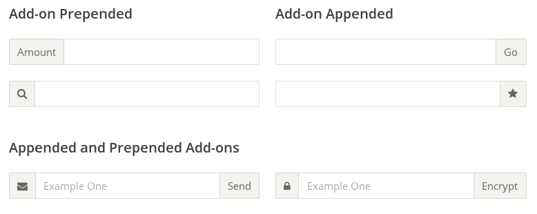
HTML 代码如下。
<div class="input-add-on">
  <span class="input-add-on-item">...</span>
  <input class="input-add-on-field" />
  <button class="input-add-on-item">...</button>
</div>
CSS 代码如下。
.input-add-on {
  display: flex;
}

.input-add-on-field {
  flex: 1;
}
悬挂式布局
有时,主栏的左侧或右侧,需要添加一个图片栏。
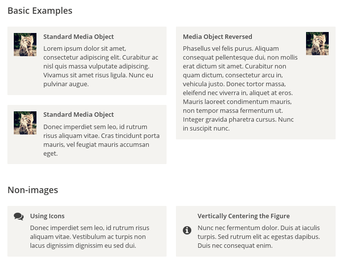
HTML 代码如下。
<div class="media">
  <img class="media-figure" src="" alt="" />
  <p class="media-body">...</p>
</div>
CSS 代码如下。
.media {
  display: flex;
  align-items: flex-start;
}

.media-figure {
  margin-right: 1em;
}

.media-body {
  flex: 1;
}
固定的底栏
有时,页面内容太少,无法占满一屏的高度,底栏就会抬高到页面的中间。这时可以采用 Flex 布局,让底栏总是出现在页面的底部。
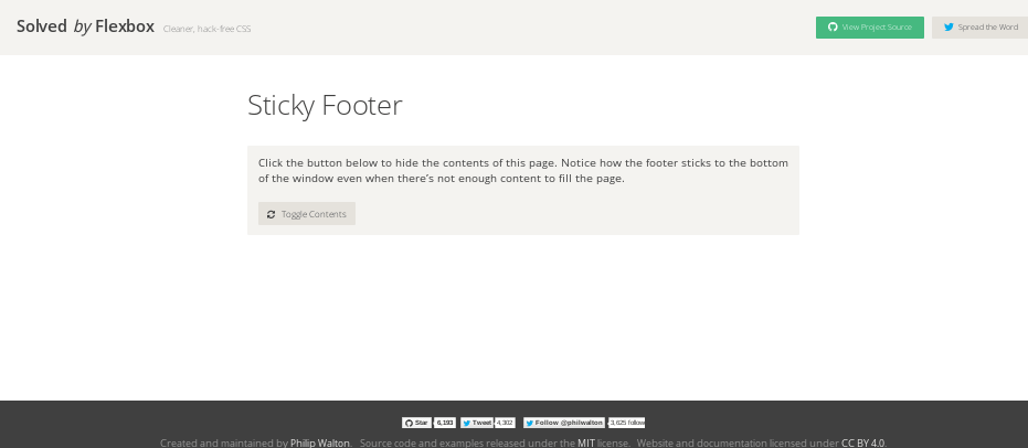
HTML 代码如下。
<body class="site">
  <header>...</header>
  <main class="site-content">...</main>
  <footer>...</footer>
</body>
CSS 代码如下。
.site {
  display: flex;
  min-height: 100vh;
  flex-direction: column;
}

.site-content {
  flex: 1;
}
流式布局

每行的项目数固定,会自动分行。
CSS 的写法。
.parent {
  width: 200px;
  height: 150px;
  background-color: black;
  display: flex;
  flex-flow: row wrap;
  align-content: flex-start;
}

.child {
  box-sizing: border-box;
  background-color: white;
  flex: 0 0 25%;
  height: 50px;
  border: 1px solid red;
}